Table of Contents:
1. New Features
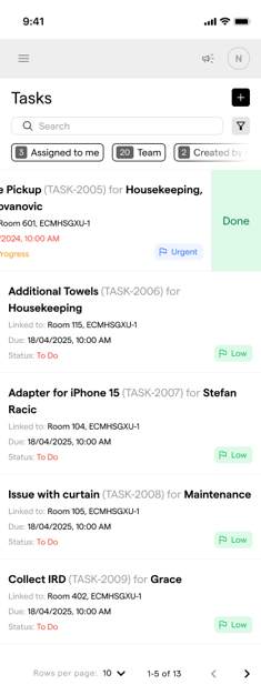
In a fast-paced hospitality environment, every second counts and staff are constantly on the move. That’s why we've redesigned the Task Management module for mobile devices, making it faster, clearer, and more intuitive to use with one hand.
a) Improved Task List Layout
-
New Grid-Like Structure:
-
Tasks are now visually grouped in a denser, clearer format
-
Tags (e.g. “Urgent”, “Low”) are more prominent
-
Vertical spacing has been optimized for easier scanning
-
-
Improved Tag Visibility:
-
Statuses like
To Do,In Progress, andDoneare clearly labeled -
Priority indicators (
Low,Urgent) are more accessible at a glance
-
New Tasks Overview Page

b) Swipe to Reveal Quick Actions
-
Quick Action: Swiping a task row to the right reveals context actions (e.g. mark as done)
-
Purpose: Enables fast interaction with tasks without opening them
-
Usage Example: A user swipes on a row and taps “Done” to instantly mark a task as completed
💡 This feature adds efficiency for staff checking off tasks on the go.
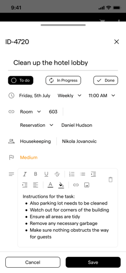
c) Task Detail View Changes
-
More Vertical Space:
-
Task form now expands higher on the screen
-
Content fields have more breathing room
-
-
New Button Alignment:
-
Action buttons (
Cancel,Save) are now pinned at the bottom for thumb reach
-
-
Description Area:
-
Shows 3 visible lines by default
-
Scrollable if text exceeds 3 rows
-
-
Swipe Down to Dismiss:
-
Users can swipe from top to bottom to close the task modal
-
This complements the “X” button in the top-right, providing a more natural and fluid gesture, especially for one-handed use
-
💡 Swiping down to close the task feels natural because it works the same way as most mobile apps do. It's especially helpful when users want to quickly back out of a task without needing to stretch for the corner "X" or scroll down to hit “Cancel.” This ensures there is no learning curve when using Tasks on mobile as we designed this similar to the apps our users use.
2. Conclusion
The Group Booking Indicator enhances visibility and operational control for group stays. By embedding a clear, interactive tag into both the reservation list and detail view, users can quickly understand context, streamline workflows, and deliver a more cohesive guest experience—especially in multi-reservation scenarios.